Sameera
Khan
Vodafone
For this project I have been in a group of 4 working on a proposal for the live Vodafone brief. My role has been to take on UX design, researcher and information co-ordinator, throughout the progression of the term I have come to focus on the UI/UX aspect that supports our proposal.
User Experience & Research
- General Research (Client, Target Audience and Ideation)
- Infographics
- Interviews
- Current and Proposed User Journeys
- Emotion mapping
- Ethnography
- Observations
- Wire-framing
User Interface
- App Design / Layout
- Icon Graphics
- Interface Mockups
Information Co-ordinator
- Contacting/ communicating with Vodafone
- Costing
- Printing Info
Project & Problem Statement
There is inefficient communication between customers seeking help and Vodafone staff members.
Customers are often ill informed of Vodafone products and services, which creates a need for them to come in store. This therefore leads to a high demand of interaction with staff and untimely causes longer, slower lines of frustrated customers.

Team
I found that I worked well with my team, being from different streams we all fell into out roles. Collaborating with work to a level we can all happy with and are able to understand. I found being around team mates who are very time efficient pushed me to complete work in a timely manner to achieve more in a shorter time frame, this worked best through the development of this project.
Challenges
We faced the challenge of having to reframe and narrow the problem down, looking into the problems that happened to cause a queue forming and not the end result of queues themselves. Researching and field review helped to gain an understanding of the technology around us to flush out the probability of a solution.
Research and/or New Skills Learned:
- Ethnography
- Revising Email Language
- Visualising Data (Infographics)
- Creating questions
- Professional documentation forms (eg consent, release forms)
Synthesis

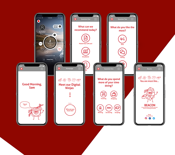
For our solution we waned to develop something innovative and creative, that improves the communication between customers seeking help and staff members.
We are hoping to not only reduce the amount of time that customers spend in store, but to significantly cut done the amount of people entering the store in the first place.
-
We updated the app to provide more accessible recommendations and knowledge on digital platforms.
-
Continue face to face customer service to teach users
-
Humanising AI/technology to make users feel comfortable.
